Hoping it works.
Magic Parsnip!
Laura's Electronic Design I blog
Wednesday, March 16, 2011
Wednesday, December 8, 2010
Surrealism Picture
Milton Glaser!
Monday, October 18, 2010
Quote Design
This is my quote design, which was a quote by John Lennon. I used color and value a great deal on this design, because blue and orange are complementary colors and because its such a cool color, orange looks great against orange too. This makes for a good contrast between the background and Lennon's face. The assignment was basically just to create a design based on a quote, and I made it my own by using an expressive, eye-catching palette and a bold design. This design didn't go through too many changes along the way that deviated from the original plan, but I WAS going to color in random words in the image to make the quote again. In the end it didnt look right and detracted from the image so i took it out.
Tuesday, October 12, 2010
The Monday (Friday) Report- Emotion Designs!
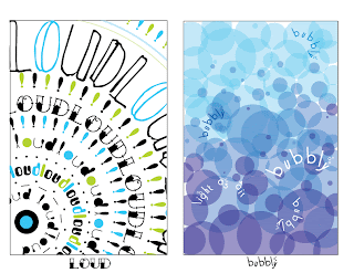
So these are my emotion pictures, showing loneliness, happiness, loudness and bubbly-ness(?). The way lines are drawn can definitely affect the mood of the drawing. For example, a dark, heavy, jagged line isn't going to remind someone of happy things, it would bring to mind a dark, angry feeling or mood. In the same way, a light, swirly line wouldn't bring to mind an angry, resentful feel. I used fonts in the same way, for example, in the lonely pic, I lowered the opacity of the font in the background and used a font that gave a quiet, mysterious feel. This made it feel quiet and lonely. Another example would be in my loud pic, i used brighter, more fun fonts and played around with the size to give the impression of sound waves. This could help me in the future, even in the next project to set the mood for text depending on what text is talking about.
Friday, October 1, 2010
The Friday Report. Logo Design
Friday, September 24, 2010
The Friday Report. ~Sanjay Patel~
So today we had to go find a graphic designer or blog that we really liked. I found several, however my favorite out of all of them had to be a book cover made by Sanjay Patel. Patel designs work based on Hindu mythology while bringing it to life with his eye-catching style. What i loved most about the site i found him on though showed the entire process of him planning and designing this cover. I love how the colors contrast and the figures are stylized, but interesting and flowing, in a way. The arrows at the bottom add movement and excitement, and points your eye towards the main character and villain. The circles and lines in the background add to the eye-catching flow of the picture. I love his style. I also love him because he's a Pixar illustrator and animator. Check out the interview that i read here!!
Subscribe to:
Comments (Atom)


